The Savannah Center for Photography Branding and Website
The Savannah Center for Photography is a non-profit based in Savannah, GA. I worked with founder and board chair Joshua Yates to design the logo, branding and website for this exciting new photography hub in the city.
Client
The Savannah Center for Photography
Services
logo
branding
website
Logo Explorations
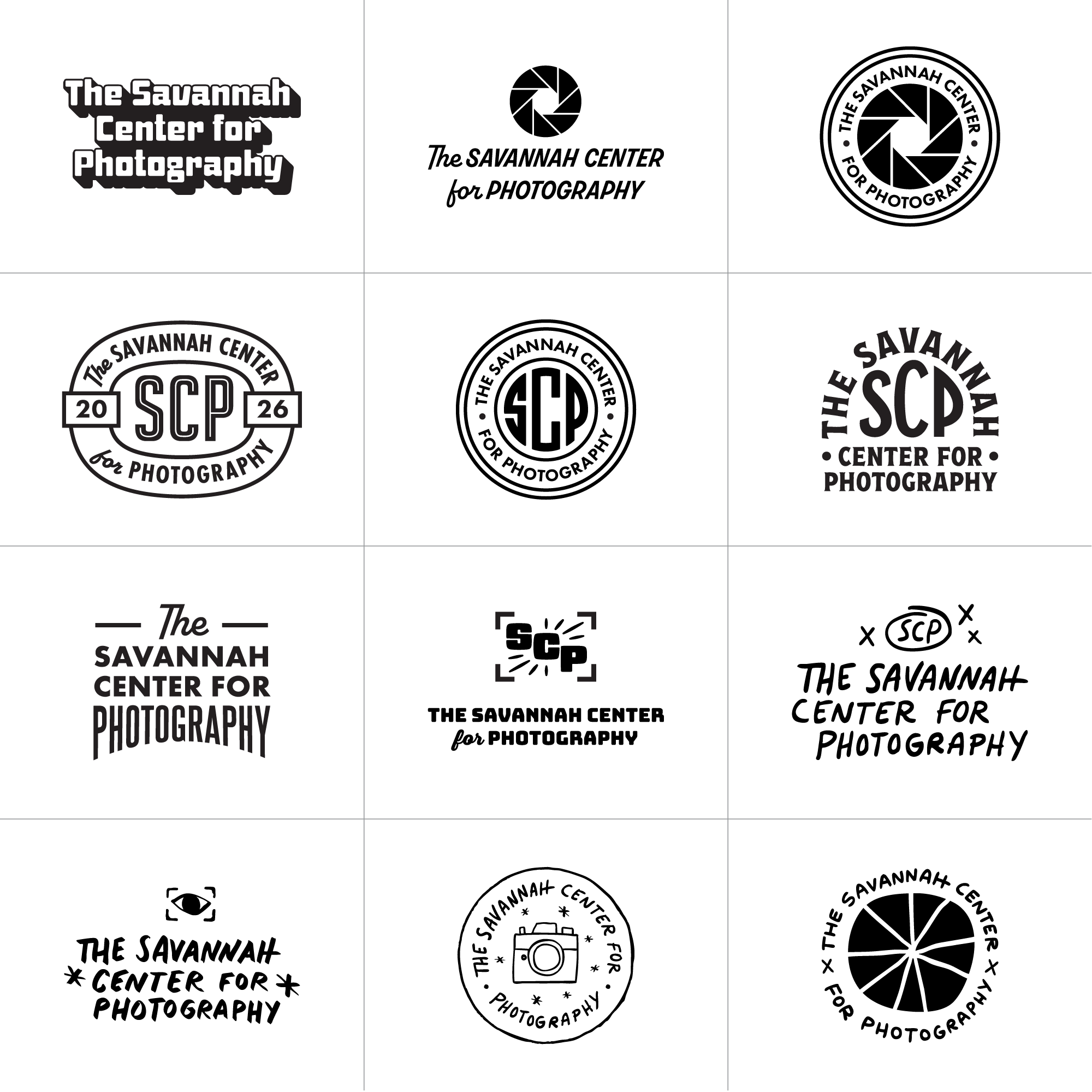
I explored options that featured the full name as well as the full name paired with the acronym “SCP”.
Acronym Only Explorations
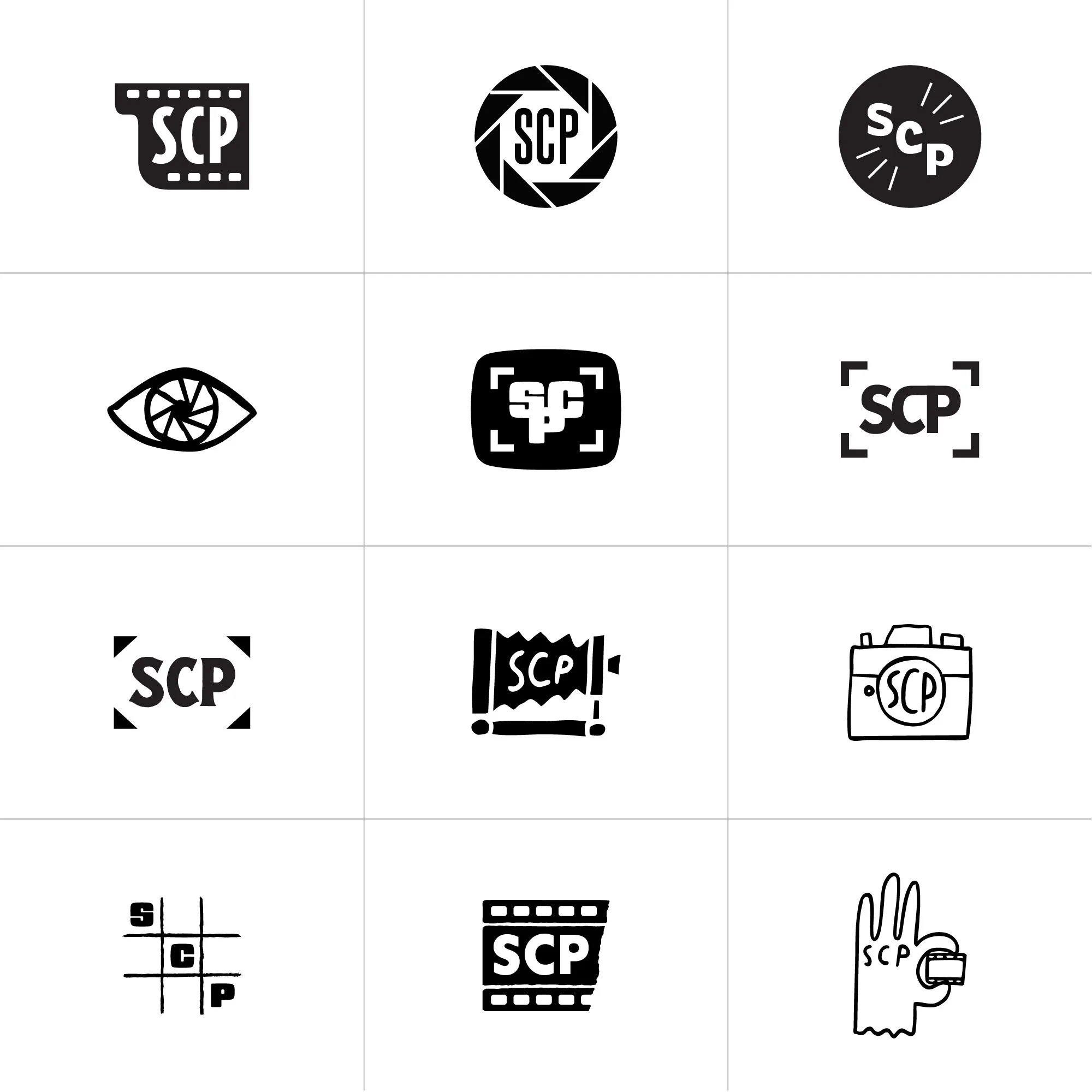
We also wanted to explore only using the acronym “SCP”.
Combo Time
The board honed in on the viewfinder element and also wanted to see what we could do with the type so we did another round of explorations to see what was possible.

Final Branding
I refined the viewfinder graphic based on feedback and paired it with a neutral type treatment to create a bold, approachable logo that works seamlessly in both horizontal and vertical formats. The acronym icon can also stand on its own, creating a flexible and intentional brand system.
Logo
Custom Brand Pattern and Color Palette
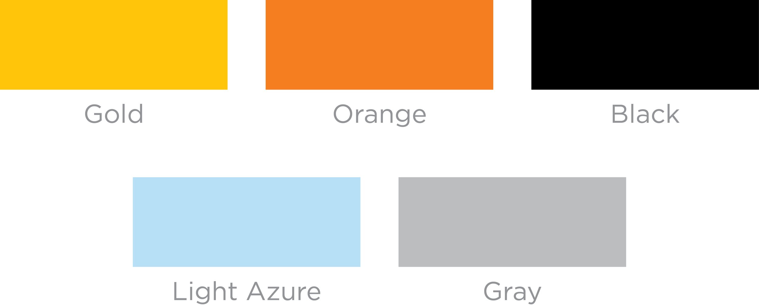
I used the acronym icon to create a pattern used for web, social media and collateral. The SCP team and I landed on a combo of warm and cool colors for the brand palette.

Custom Brand Illustration
Illustrations from an earlier round made their way into the final look, adding warmth and a touch of “DIY” as a nod to the heart of black-and-white photography.